Treshawn's World
Wednesday, January 5, 2011
Friday, December 10, 2010
Tuesday, November 23, 2010
Monday, November 15, 2010
Wednesday, November 10, 2010
Inspired By...
 |
| Original |
 |
| Mine |
I was inspired by Keith Robinson. I liked how his people looked like cartoons from some kind of show. I took that idea and made the characters in my picture. His background is also very detailed but it's blurred in the picture. I wanted to have detail in my background too but I wanted to show it off.
Monday, November 8, 2010
Wednesday, November 3, 2010
Elements and Principles of Design
(definitions under photos)
LINE
Line can be considered in two ways. The linear marks made with a pen or brush or the edge created when two shapes meet.
Line can be considered in two ways. The linear marks made with a pen or brush or the edge created when two shapes meet.
SHAPE
A shape is a self contained defined area of geometric or organic form. A positive shape in a painting automatically creates a negative shape.
A shape is a self contained defined area of geometric or organic form. A positive shape in a painting automatically creates a negative shape.
DIRECTION
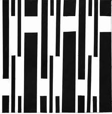
All lines have direction - Horizontal, Vertical or Oblique. Horizontal suggests calmness, stability and tranquillity. Vertical gives a feeling of balance, formality and alertness. Oblique suggests movement and action
All lines have direction - Horizontal, Vertical or Oblique. Horizontal suggests calmness, stability and tranquillity. Vertical gives a feeling of balance, formality and alertness. Oblique suggests movement and action
SIZE
Size is simply the relationship of the area occupied by one shape to that of another.
TEXTURE
Texture is the surface quality of a shape - rough, smooth, soft hard glossy etc. Texture can be physical (tactile) or visual.
COLOR
Also called Hue
BALANCE
A large shape close to the center can be balanced
by a small shape close to the edge. A large light
toned shape will be balanced by a small dark toned
shape
GRADATION
Gradation of size and direction produce linear perspective. Gradation of of colour from warm to cool and tone from dark to light produce aerial perspective. Gradation can add interest and movement to a shape. A gradation from dark to light will cause the eye to move along a shape.
Gradation of size and direction produce linear perspective. Gradation of of colour from warm to cool and tone from dark to light produce aerial perspective. Gradation can add interest and movement to a shape. A gradation from dark to light will cause the eye to move along a shape.
REPETITION
Repetition with variation is interesting, without variation repetition can become monotonous.
Repetition with variation is interesting, without variation repetition can become monotonous.
CONTRAST
Contrast is the juxtaposition of opposing elements eg. opposite colours on the colour wheel - red / green, blue / orange etc. Contrast in tone or value - light / dark. Contrast in direction - horizontal / vertical.
Contrast is the juxtaposition of opposing elements eg. opposite colours on the colour wheel - red / green, blue / orange etc. Contrast in tone or value - light / dark. Contrast in direction - horizontal / vertical.
The major contrast in a painting should be located at the center of interest. Too much contrast scattered throughout a painting can destroy unity and make a work difficult to look at. Unless a feeling of chaos and confusion are what you are seeking, it is a good idea to carefully consider where to place your areas of maximum contrast.
HARMONY
Harmony in painting is the visually satisfying effect of combining similar, related elements. eg.adjacent colours on the colour wheel, similar shapes etc.
DOMINANCE
Dominance gives a painting interest, counteracting confusion and monotony. Dominance can be applied to one or more of the elements to give emphasis
UNITY
Relating the design elements to the the idea being expressed in a painting reinforces the principal of unity.eg. a painting with an active aggressive subject would work better with a dominant oblique direction, course, rough texture, angular lines etc. whereas a quiet passive subject would benefit from horizontal lines, soft texture and less tonal contrast.
Unity in a painting also refers to the visual linking of various elements of the work.
Subscribe to:
Comments (Atom)


